Borea - Laurentien Retreat
Branding
Mandate
The Société de développement VDL, Groupe Immobilier Van Houtte and Société Immobilière Omni wish to promote their Val-des-Lacs development project in the Laurentians. Close to Mont-Tremblant, the real estate project involves properties with self-building permits. The vision? A neighbourhood built in harmony with the boreal forest. Our mandate is to create an identity for the project through the development of a distinctive name and tagline, including all graphics to be used on their pre-sale website.
Services
Web Design, Web Programming, Web Integration, Artistic Direction, Consulting Service, Design-writing, Graphic Design
Think
As with all real estate development projects, the emphasis must be on creating a vision that will make potential clients dream big from the very start. Our strategy is built on promoting the location of the development and focusing on its expansive green spaces, as well as its proximity to the area’s abundant wildlife.
Create
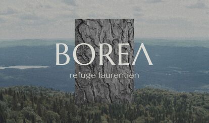
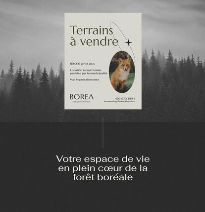
This focus is what inspired the project’s name and descriptive tagline, BOREA: A Laurentian Retreat. It reflects the feeling of being in a unique and peaceful haven in the heart of the Laurentians’ boreal forest.
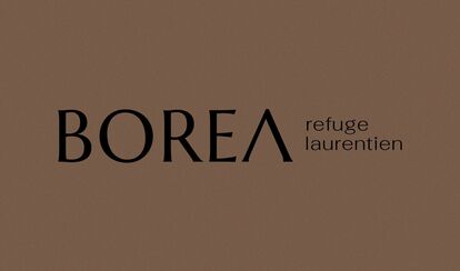
The typographical logo was designed with a particular twist: The horizontal line in the A, at the end of the name, is omitted to symbolize a mountain.
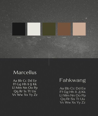
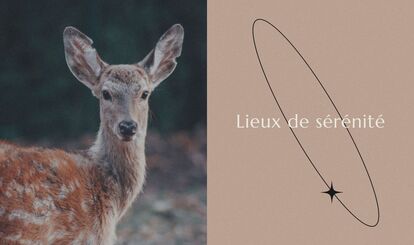
Luminous imagery puts the splendour of the Laurentian flora and fauna at the forefront and is balanced by a neutral colour palette, leaving plenty of space for the living colours of nature itself.
Display
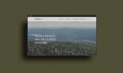
The bilingual website will be the main sales tool for real estate agents. Equipped with an evolving map displaying the available lots along with their respective characteristics, the website will be an immersive experience and allow potential clients to clearly envision their new retreat at BOREA.
