Archipel

Display Strategy and Branding

Mandate

Recently merged, the Ottawa East Ontario Health Team (OHT) and the Prescott Russell in Development Team are facing issues of recognition and belonging. Our mandate: develop a branding strategy and strong new identity that reflects the scope of services offered to the public and the new geographic area being served. To increase the understanding and support of all the targets, the new identity must also work well in both official languages.


Services

Rollout Strategy, Web Design, Artistic Direction, Design-writing, Graphic Design

Think

OHT is experiencing issues regarding recognition. The public does not clearly understand the mission of the group of healthcare professionals. People are unable to tell which OHT is theirs (there are many of them in Ontario, each serving a different area), and they are unfamiliar with the services offered. The team analyzed the situation to identify the shortfalls and act accordingly. OHT’s offering has all the elements to stand out, and the team must highlight its range of benefits for the target population. 


Create

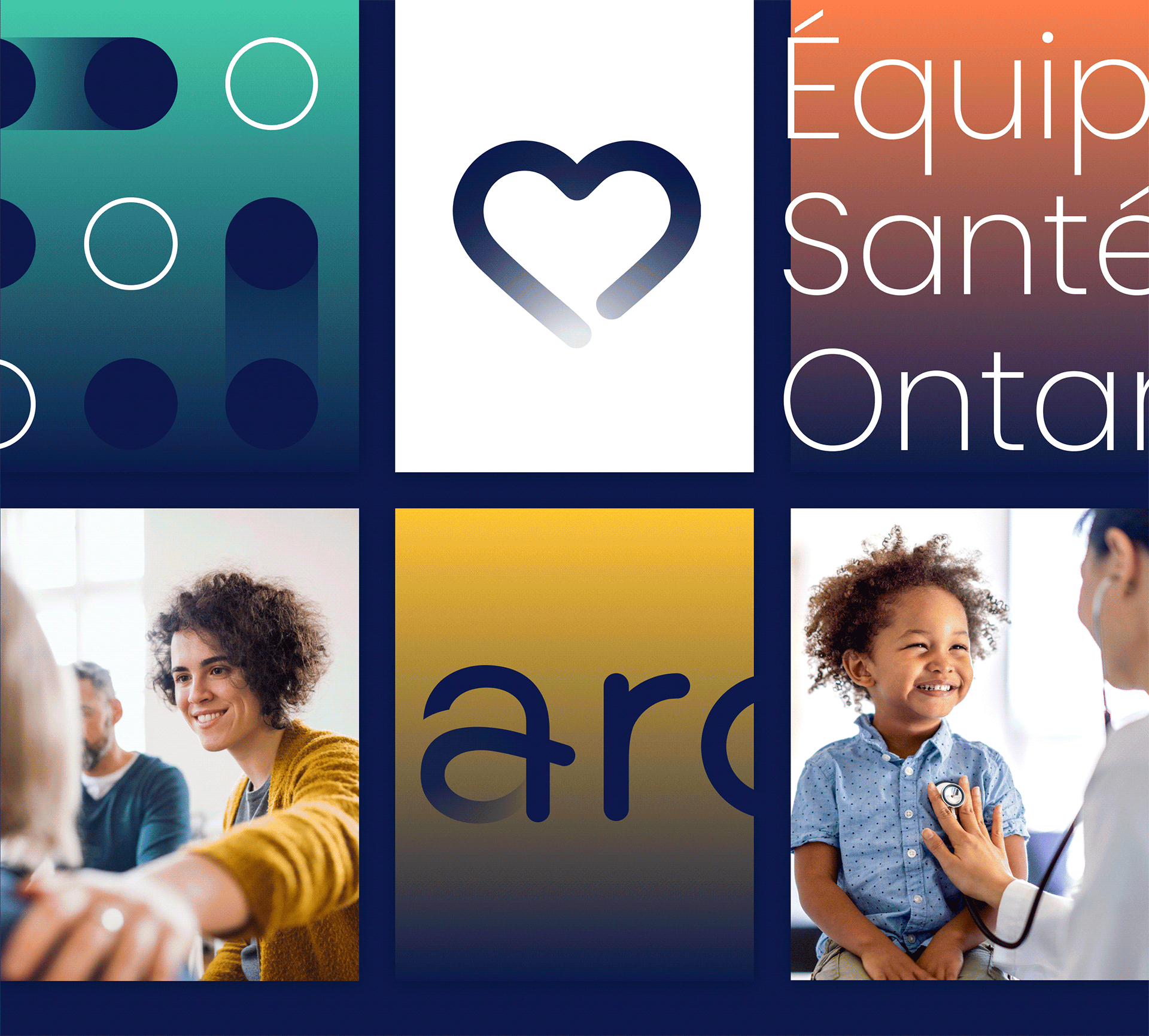
The new branding is based on a precise strategy. The name is created, inspired by the Ottawa River that borders the territory. Its many islands, all interconnected, evoke the users and healthcare providers. “Archipel” (archipelago, in English) emerges. The confluence point is symbolized by the outline of the logo. The “a” emphasizes the benefits of the interconnection of services and the extension of the geographic area. The mission is expressed by the bond that brings human beings together, and the message of collaboration is conveyed through the name, and the choice of lines and palette. The harmonious health journey is central to the new identity.

Display

With solid foundations and a new name that resonates in both French and English, Archipel is ready to be rolled out. The team used creativity in all its forms to achieve its goals: recognition by the target audience and the support of partners. The appropriation of the brand touches on all the elements. Logos, icons, image bank, graphic standards, presentations, internal guidelines: Archipel now has all the tools it needs to be recognized at every point of contact.