FoodFabrik

Branding

Mandate

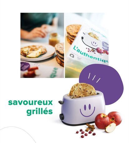
Mejicano, already well known for its flavoured tortillas, has launched a new brand, La Food Fabrik – Boulangerie Urbaine, along with a new range of products: four varieties of breakfast buns. The company enlisted Erod to create a brand image and visual identity for the packaging of these four new products. 


Services

Artistic Direction, Consulting Service, Design-writing, Graphic Design

A “La Food Fabrik” product package is shown in close-up on a table, next to a plate containing a roll, strawberries and blueberries. The “La Food Fabrik” logo appears in red on a plain background, with three pink hearts superimposed in the background.
Four “La Food Fabrik” bakery product logos: “Petit Pain Ensoleillé” (orange), “Petit Pain Explorateur” (red), “Petit Pain Authentique” (purple) and “Petit Pain Champêtre” (blue). Each logo features a stylized heart composed of several layers of color.
A hand picks up a bun next to “La Food Fabrik” brand packaging with a smiling face logo and the words “champêtre” (“country”). A plate of rolls garnished with strawberries and blueberries is visible in the foreground.
A picture divided into three parts.On the left, a hand spreads a spread on a toasted bun, next to slices of apple and pear. In the center, a package of “L'Authentique” rolls from La Food Fabrik. On the right, a purple toaster with a smiling face holds two
A plate of breakfast bread topped with strawberries, shredded coconut and syrup, accompanied by a glass of orange juice and orange slices. Next to it, a “L'ensoleillé” food packaging with the words “la food fabrik” and “bon appétit”.
Several packages of Food Fabrik brand breads are set against an orange background. The packages are in different colors and bear the names “L'ensoleillé”, “L'explorateur” and “L'authentique”. Each package features an illustration of a smiling toaster, a l

Think

When considering package design, we looked at both the competition and product placement in the points of sale. We then prioritized branding by considering the personality of each of the four flavours, which led us to create a unique and playful name for each one.


Create

The proposed logo is youthful and original. It brings a breath of fresh air to the brand. The fun and colourful packaging suggests a bright and sunny start to the day. Important information is easily visible without overcrowding the visuals. Thanks to the catchy names and appealing imagery, we immediately feel like giving these buns a try.


Display

These four breakfast buns proudly sport their new packaging on grocery shelves. Look for them today and choose the flavour that best suits your personality! 


Blueberry: Le champêtre (Country Kitchen) 

Apple Raisin Cinnamon: L'authentique (The Classic)

Orange and Cranberry: L'ensoleillé (Rise and Shine)

Dates and Chia Seeds: L'explorateur (The Explorer)