Halo dentisterie

Branding

Mandate

Founded over 20 years ago, Centre dentaire Beldent recently changed ownership. To continue its mission of excellence, minimize the risk of losing customers and ensure a smooth transition, the new owners wanted to rethink their positioning as a whole. Our mandate: define and create a custom brand image to rally the team and customers around a whole new identity.

Services

Artistic Direction, Marketing Strategy, Consulting Service, Design-writing, Graphic Design

Logo for Halo Dentistry, a dental clinic. The logo features the word “HALO” in orange on a dark purple background, with an asterisk in place of the “A”. The word “DENTISTERIE” is written below it in smaller size, also in orange.
GIF of two alternating images. The first is of a man with brown hair and a gray sweater brushing his teeth. The man has a smile on his face. The second photo is of the same man with the toothbrush in a different place in his mouth. The alternation of the
The typography named “Outfit” is written in bold type, followed by the lower-case alphabet below. A color palette is represented by four horizontal bars at the top of the image, ranging from dark red to gray.
A logo with the word “HALO” written in white on a black background. The “A” in HALO is stylized and resembles a chair. Above it is a white shape evoking a smile or halo.
A collage of business cards for the Halo dental clinic. The cards feature the Halo logo, which is a stylized smile, and contact information for Dr. Maher Amoura, dentist, and Chantal Léonard, treatment plan coordinator. The cards are in a warm color palet
An illustration of a tooth with dental floss wrapped around it, next to a bamboo toothbrush with the HALO logo.
Animated GIF of orange text on a dark purple background. Words appear one at a time. It says “Health, beauty and comfort”.
Image of a woman flossing her teeth.
An illustration showing four elements of oral hygiene: a tooth with dental floss, a tube of toothpaste, a tooth with braces and a toothbrush with toothpaste.
Image of a man flossing his teeth. The image is positioned on a pale orange background with a white hyphen with the ends curved upwards in the shape of a smile.

Think

The team identified the context, goals and target audience. Recognized for the quality of its welcome and its technologies, the centre ran into problems with hiring and retention. The change of administration was the perfect opportunity to strengthen customer confidence and, at the same time, take advantage of the employer brand. The new name and image had to inspire well-being and reflect the full spectrum of services. “Halo, dentisterie” was created.

Create

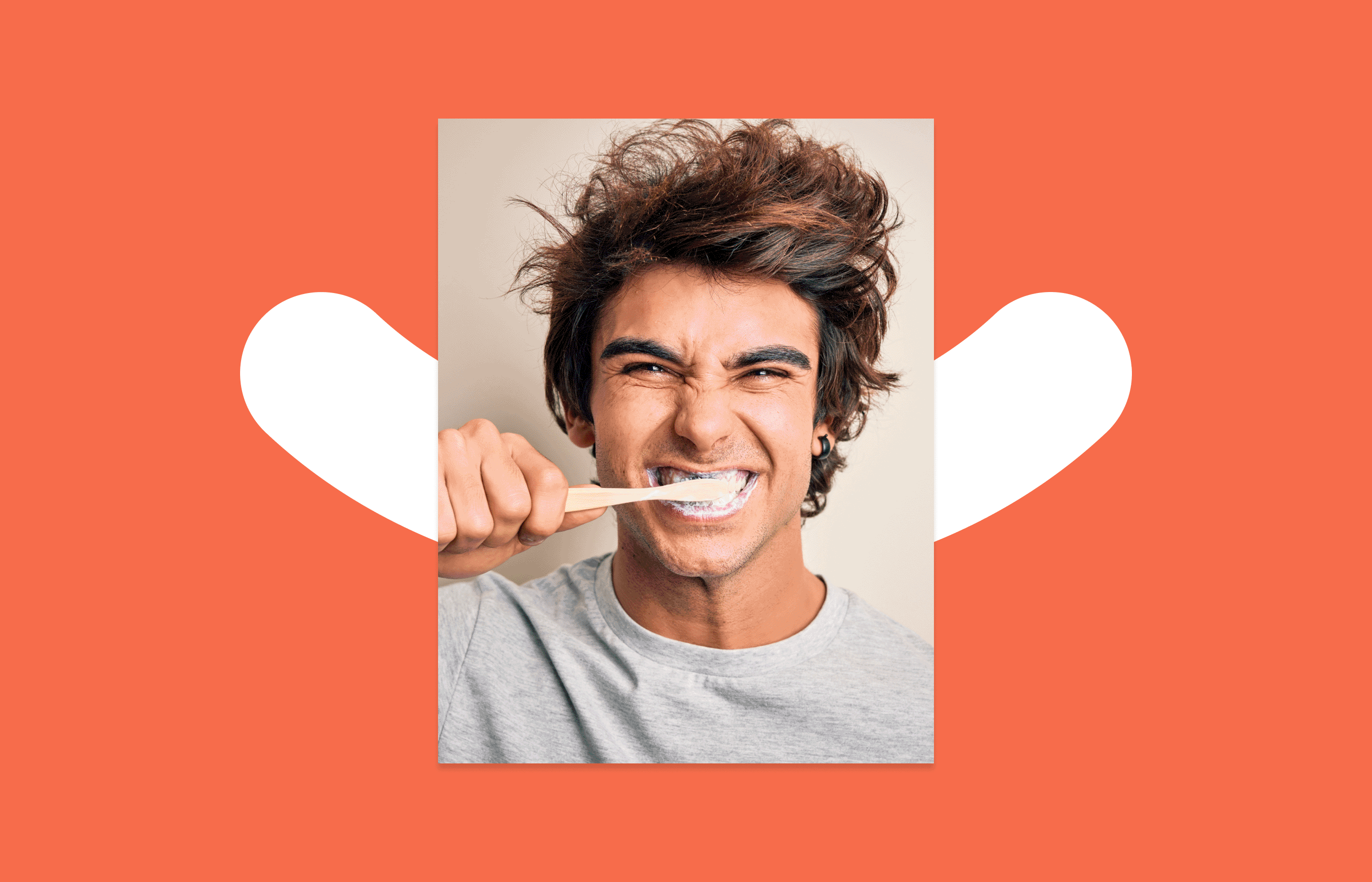
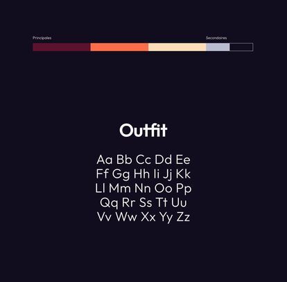
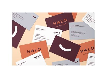
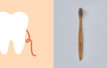
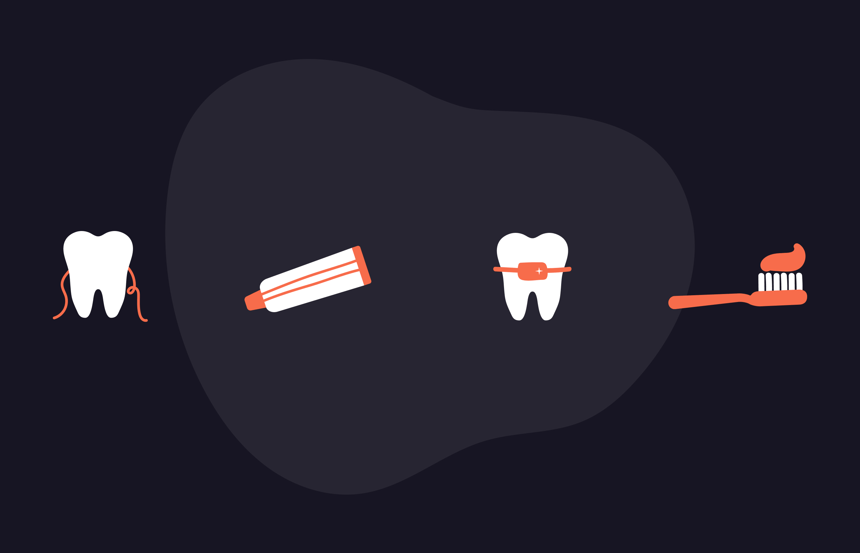
A glowing light emanating from a person or a luminous ring around a light source, “Halo” is also a nod to the dentist’s blinding light. Its radiant effect inspires the logo, imagery and photography, which all feature a person in the foreground. The vibrant, complementary colours form a palette, which, like a smile, attracts attention. The typography is rounded, accessible and friendly. The overall visual identity evokes well-being and personal fulfillment for customers and employees.

Display

Building on a strong brand and positioning, “Halo” is now being rolled out across all touchpoints. Business cards, interior design proposals for the centre, stationery, headers and signatures, visual content for social media: the branding promotes the trademark and the employer’s brand. Like a luminous aura radiating out from the centre, “Halo” is moving forward positively to achieve a successful transition and pursue its mission.