Indigo Soda

Rollout Strategy, 2024

Mandate

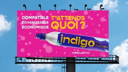
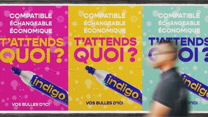
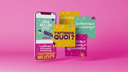
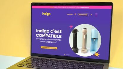
In 2024, Indigo Soda’s main goal was to build awareness in Quebec and Ontario, with a Canada-wide impact. Based on two years of success, the strategy focused on refreshed visual elements, campaign messages and a media mix that drew heavily and simply on the brand’s pillars of communication. By highlighting these pillars (economical, compatible and exchangeable), we challenged major competitors such as SodaStreamMC, in the hopes that the brand would play a significant role in the market and in the lives of consumers.

Services

Rollout Strategy, Web Design, Web Programming, Artistic Direction, Marketing Strategy, Consulting Service, Design-writing, Graphic Design, Digital Strategy, Advertising Strategy, Social Media Strategy

Play
Play
A bright pink billboard with the text “Compatible, Exchangeable, Economical. What are you waiting for?” in large white letters. In the center of the image, a cylinder of Indigo C02 is highlighted, with the words “indigo” and “Vos bulles d'ici” (“Your bubb
Three posters advertising Indigo CO2 cylinders. The posters are colored pink, yellow and blue. They feature the words “compatible”, “échangeable” and “économique” in French, as well as the slogan “T'attends quoi?” and the words “Vos bulles d'ici”. A cylin
A cell phone displays an advertisement for Indigo CO2 cylinders with the slogan “Your bubbles from here”. Around the phone, colorful cards highlight the product's advantages: “compatible”, ‘exchangeable’ and ‘economical’. The text “What are you waiting fo
A hand pours sparkling water from a clear plastic bottle into a glass filled with ice cubes and iced tea of a rosy hue. A strawberry sits on the rim of the glass.
A picture divided into two parts. On the left, three bottles of Indigo sparkling water filled with water and fruit are stored in a citrus refrigerator. On the right, a cocktail glass filled with a pink smoothie and garnished with an orange straw.
A picture divided into two parts. On the left, a glass filled with sparkling green matcha cocktail, garnished with round ice cubes and lime slices. On the right, two glasses filled with sparkling water: one blue with blackberries and rosemary, the other p
GIF of two reusable sparkling water bottles. The bottles appear one at a time. One slides in from the left and the other from the top. The first bottle is transparent, with a rose-gold cap and base trim. The other is also transparent, with a brushed alumi
A laptop computer displays a promotional web page for an Indigo brand sparkling water machine adapter. The adapter is compatible with all brands of sparkling water machines. Three sparkling water machines in different colors are shown on the page. The tex

Think

Indigo’s goal of increasingly being seen as the main alternative to SodaStream, expanding its growth as a brand, acquiring more market share and generating more sales was central to our thinking. This new awareness campaign and refresh of the vast majority of visual elements was a way of extending the brand launch. The main goal was to achieve greater visibility: we acted as though the brand were still unknown to the general public.


Create

At first, we drew inspiration from the colourful branding created by the agency, hoping to take it even further with an advertising message that would serve as an anchor. We provided audiences with an energizing advertising experience that would make a strong impression. We created movement through bright colours, and energy through lively animation and rhythmic music, producing carefully edited content that would be viewed over and over again. We drew attention with sparkling, fresh and festive eye candy, both in the advertising messages and the refreshed visual elements on social media and the web.

Display

This new awareness phase for Indigo was rolled out through a strategy aimed at reaching its target audience, while embracing a desire to build the brand among as broad a public as possible. Through television ads that use cutting-edge motion design, we aimed to capture the imagination by promoting a fresh and current image. We featured short key words that became inextricably linked to the product. In addition, a digital campaign (Google, Meta) directly modelled on the ads expanded awareness and the pillars on all fronts.